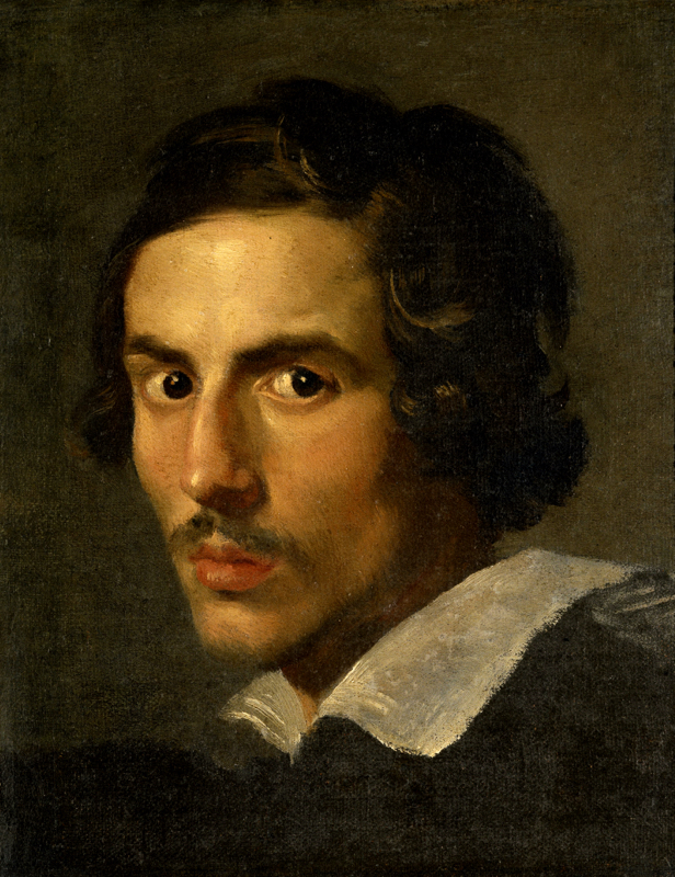
He is looking at you, the viewer, with his big dark brown eyes. His gaze is shifted slightly to the right, as his head is slightly angled away from a frontal angle. The background is musty, causing the viewer’s eyes to be immediately drawn to the bright colors of his face. His skin is a compilation of several tones of beige, yellows and oranges, giving off a warm glow. The light source is evident with highlights in both of the subjects eyes, his forehead, his noes, cheeks and chin. The highlights on his head help to shape his wavy brown locks. Apart from his face, the other moment of lightness is the color on the collar of his clothing. His lips are a deep pink, framed by his goatee. He is placed almost perfectly centered on the canvas. Despite this taboo, the composition is quite successful with the moments of lightness and contrasting darkness used to guide the viewer’s eye around the page. Not only is there an obvious variation in tone and contrast, the treatment of the paint also changes throughout. While the face and hair of the figure appear much more photorealistic, the clothing he is wearing and the background both evoke more evidence of broken brush strokes and the colors of which these areas are composed of are visible as opposed to being blended together as seen on the figure himself. While there is lots of attention to detail on the figure’s head, his clothing and the space he is placed in have less clarity, clearly identifying him as the subject and most important element of this piece.
(Self Portrait of Bernini, c. 1623, oil painting, Borghese Gallery)